Improved usability of Sign-in process

Posted
1
0
7,311
1 MIN

We conducted significant work to improve the usability of authentication popup.

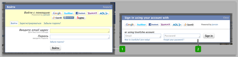
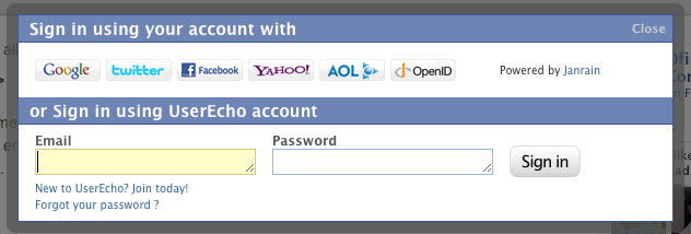
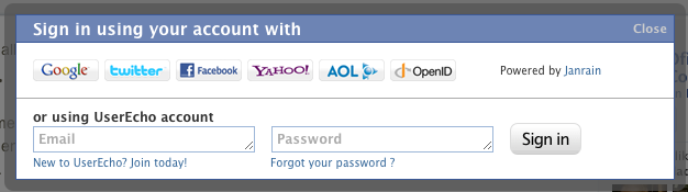
Look at screenshot below to see a results. Fig.1 It was. Fig.2 Current.


Now we show steps of progress. How did we come to the current latest version.
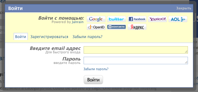

It was:

There was a big illogical with scattered elements and functions popup.


Image 214


Step1:

We removed italic font and put tabs on their place without spacing between tabs and lower block.
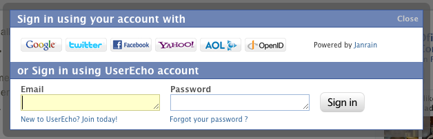


Step2:

Then we place elements more compact and  removed unneeded captions from input fields.
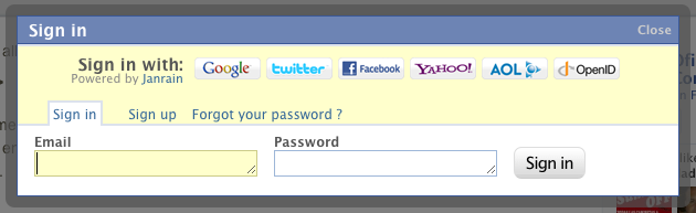


Step 3:

1) More intuitive headers

2) Removed tabs and unneeded background color

3) Thinking about blue bars
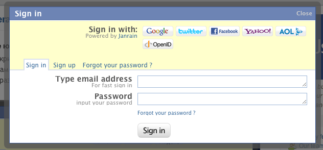


Step 4:

Password remind link moved under pass field.


Step 5:

1) Removed second blue bar

2) Field captions placed inside as helpers


Avatar
POSTED BY
Sergey Stukov
Co-founder at UserEcho, Enterpreneur, Django/Python expert.
Avatar
Peter Chon
I dont' get it. So, did this improve the usability?
Avatar
Martin Reisbeck
What do you think Peter? Please, don't hesitate to make your proposals.
Avatar
Cristiano Betta
Sorry mate but without any stats on conversion or sign-in speed or anything this isn't any prove of "improved" usability. Nice redesign exercise though.
Avatar
Martin Reisbeck
Quote from Cristiano Betta
Sorry mate but without any stats on conversion or sign-in speed or anything this isn't any prove of "improved" usability. Nice redesign exercise though.
Thanks for your feedback, Christiano. Of course it's not a real improve of speed in miliseconds while transmission and serverside process. You are right in this strict interpretation of speed. But it is a tremendous improve of usability to let the user divine what to do next, isn't it? Simplifying the user interface means to improve the speed of a process. There's no doubt about.
Avatar
Sergey Stukov co-founder
Find out example how UserEcho sign-up/sign-in form can be customized in our Custom service plan.

Avatar
Michael Aivaliotis
I've had some feedback from some of our users. They are confused about what they need to enter in the first field. They do not see that it is email address because the word "Email" is missing. If you click on the "Join today" link, the next dialog places the cursor in the first field. See Image 2:


As you can see, there is some confusion.

Also, this happens when you click on the login link from the home page. The cursor is already inside the field, so the word "Email" is missing.
Avatar
Sergey Stukov co-founder
Quote from Michael Aivaliotis
I've had some feedback from some of our users. They are confused about what they need to enter in the first field. They do not see that it is email address because the word "Email" is missing. If you click on the "Join today" link, the next dialog places the cursor in the first field. See Image 2:


As you can see, there is some confusion.

Also, this happens when you click on the login link from the home page. The cursor is already inside the field, so the word "Email" is missing.
1st variant, that we see, let's suppose that helper will be visible until user will start entering text.
Avatar
Sergey Stukov co-founder
Quote from Sergey Stukov
1st variant, that we see, let's suppose that helper will be visible until user will start entering text.
1st variant applied, it's more clear for users now.

Suggestions appreciated.